NOTE: This article is from 2016.
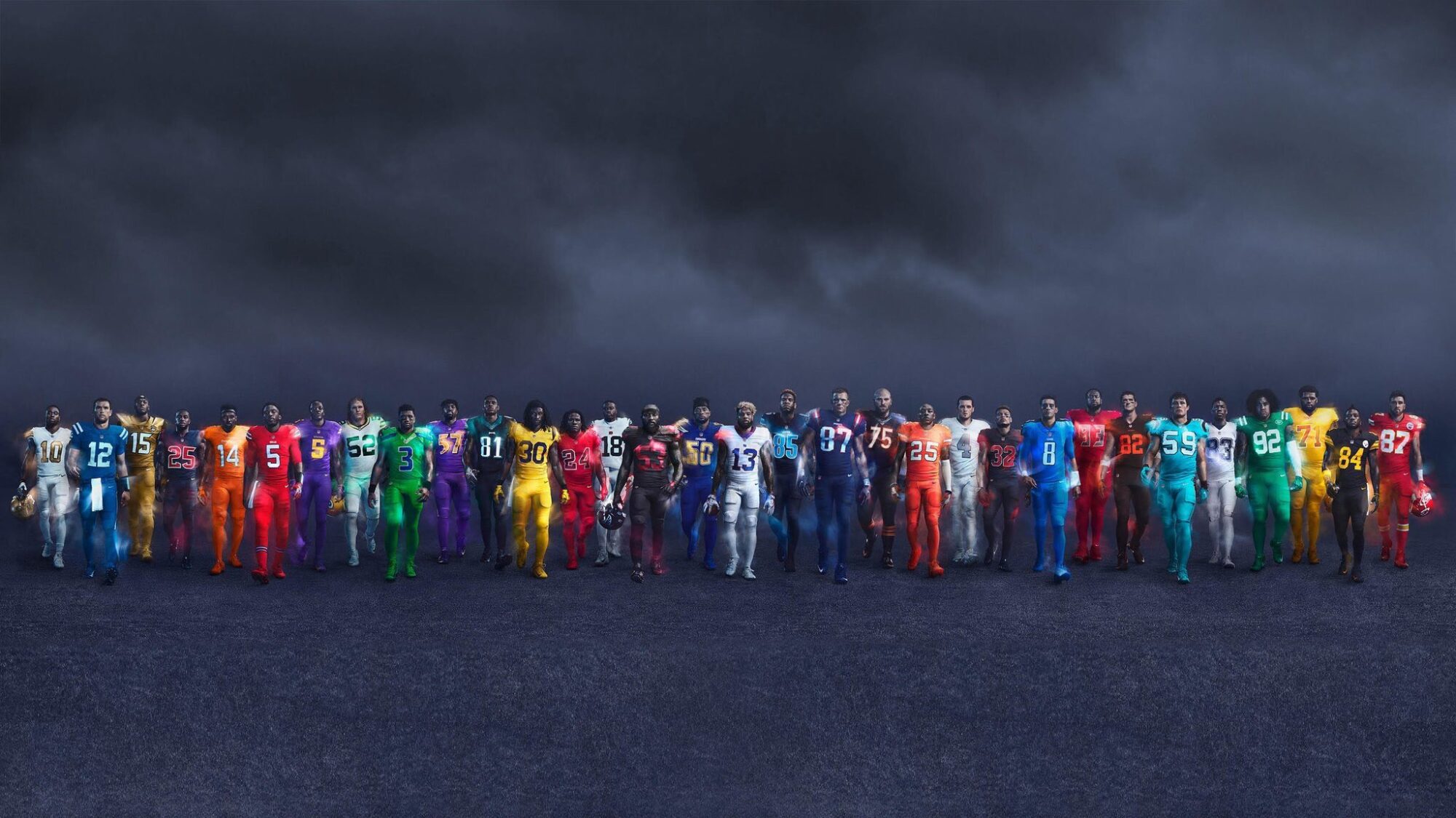
I’m a huge sports fan. I’m also a designer. There’s not a whole lot of crossover in those two worlds. But when there is, the NFL calls it “color rush.” I love when teams change up the look of their uniforms. In my world, every team would (excuse the pun) take a page out of Oregon’s playbook and constantly switch up uniforms.
It seems this year the league is capitalizing on the color rush uniforms by making them available for purchase online. I’m all for it. Below are my rankings from worst to first from a design (and team culture) perspective. I also took into account the uniform as a whole – including the unchanged or throwback helmets.
I should note that teams are not allowed to change their helmets except for throwback versions.
All images copyright NFL and Nike.
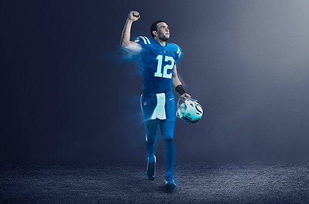
32. Indianapolis Colts

I know it’s hard when you only have one color, and you use that color for your uniform already, but this is literally the combination of the home jersey and away pants. Yawn.
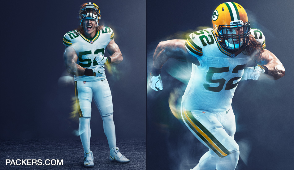
31. Green Bay Packers

Again. Same home jersey and turn your standard pants white and boom! Color rush.
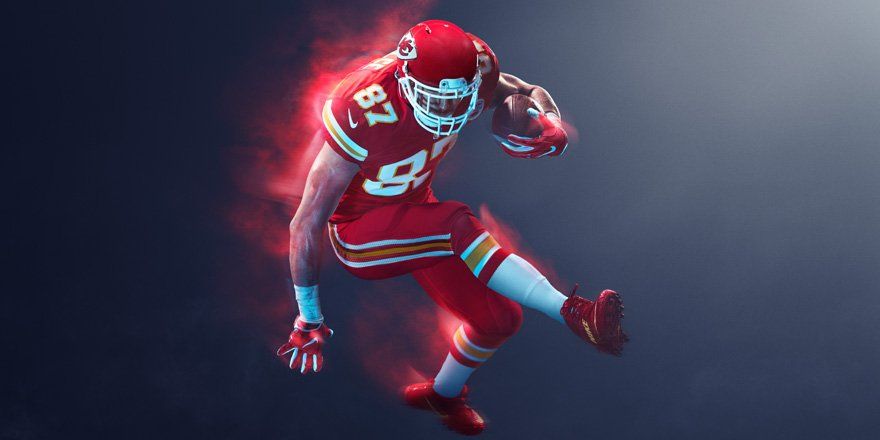
30. Kansas City Chiefs

I don’t even think they changed anything.
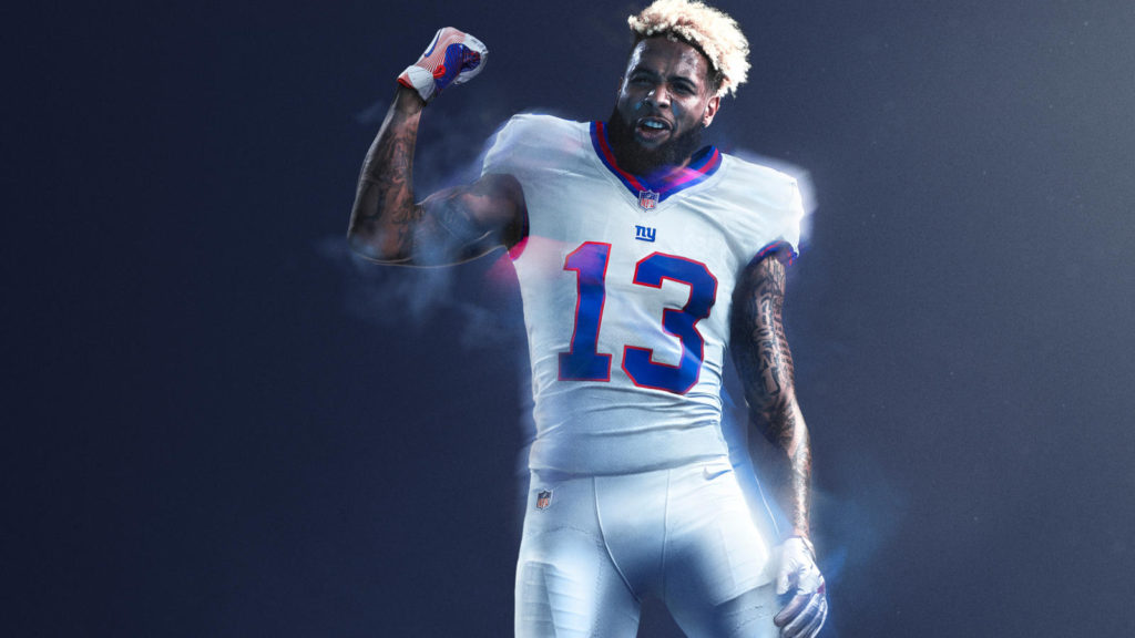
29. New York Giants
You move up from 32 for getting rid of those God-awful gray pants.
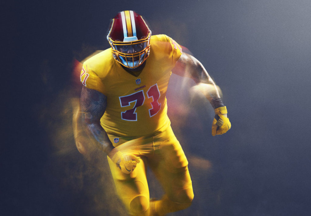
28. Washington Redskins
You’ve made a jersey out of condiments. And mustard is the worst condiment of them all.
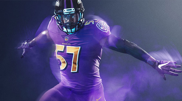
27. Baltimore Ravens

All I can think of is the Purple People Eater. Points for working with a terrible color palette to begin with.
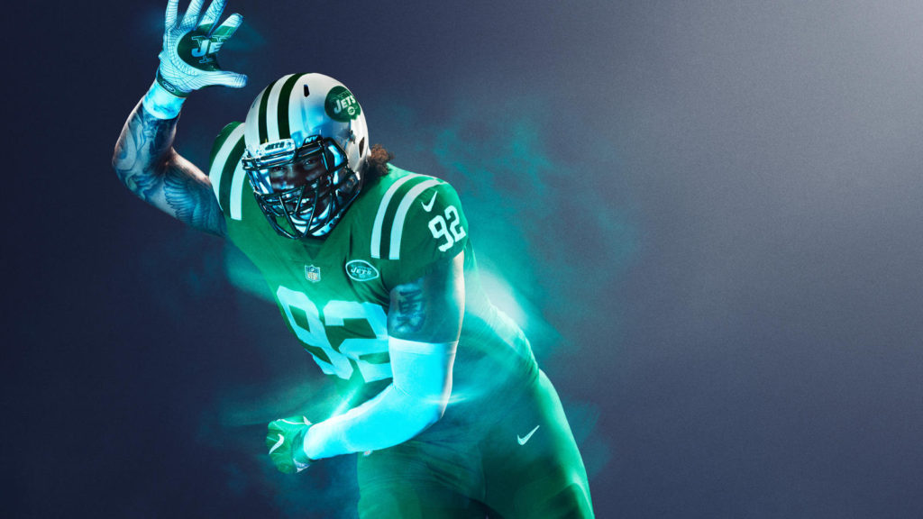
26. New York Jets

These only work in movie special effects or trying to blend in with the field itself. I would be more suspicious if it were the Patriots.
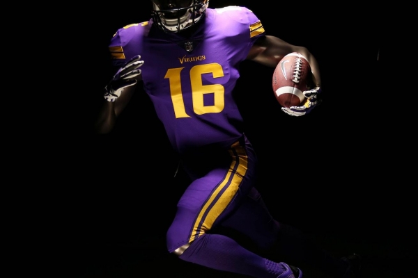
25. Minnesota Vikings

Better than the Ravens, still don’t like the purple though.
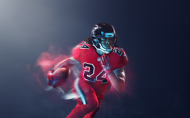
24. Atlanta Falcons

Falcons could have been the Miami Sharks of the NFL (think Any Given Sunday). But instead, we get a uniform that can be seen on Friday nights across the country. Nothing terrible about them though. Still better than their primary uniforms at this point.
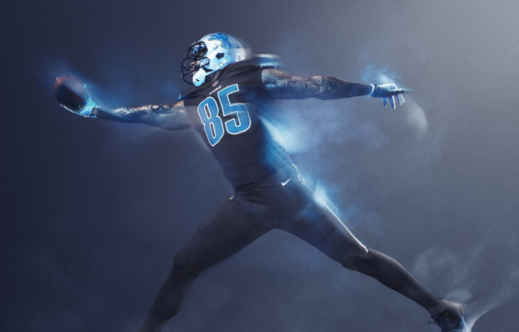
23. Detroit Lions

I don’t dislike these, but I can’t help but feel like the black is a bit out of left field, especially with so many other teams going with black for their color rush and doing it a bit better.
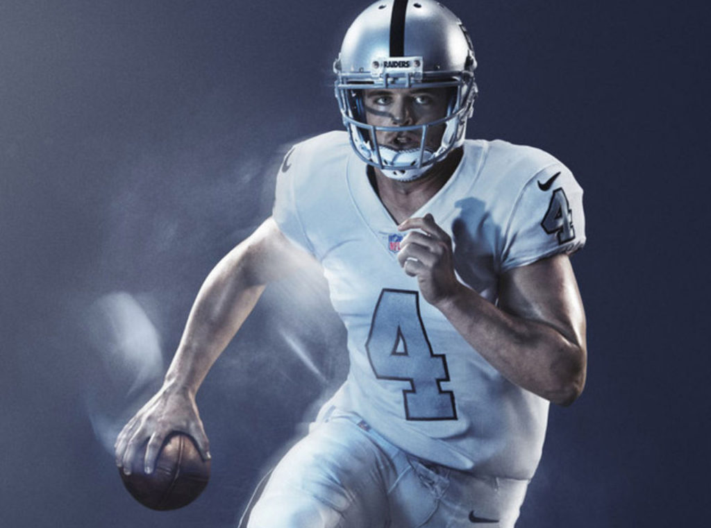
22. Oakland Raiders
The one team that should be all black ironically isn’t.
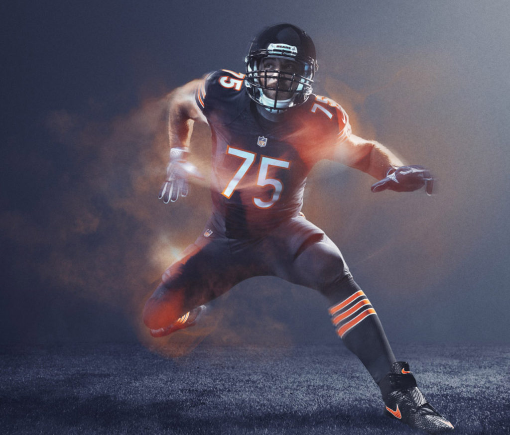
21. Chicago Bears

These are far and away better than their normal uniforms, but doesn’t do anything special for me.
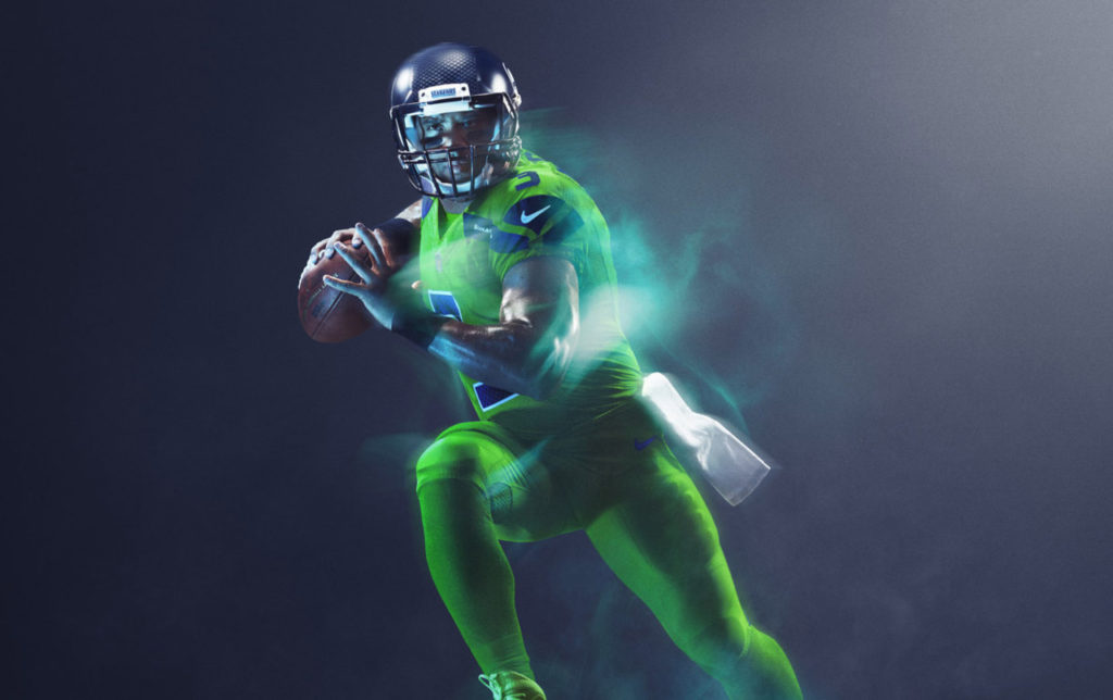
20. Seattle Seahawks
Kudos for fully embracing the neon green. Now there can be an entire NFL team in morph suits.
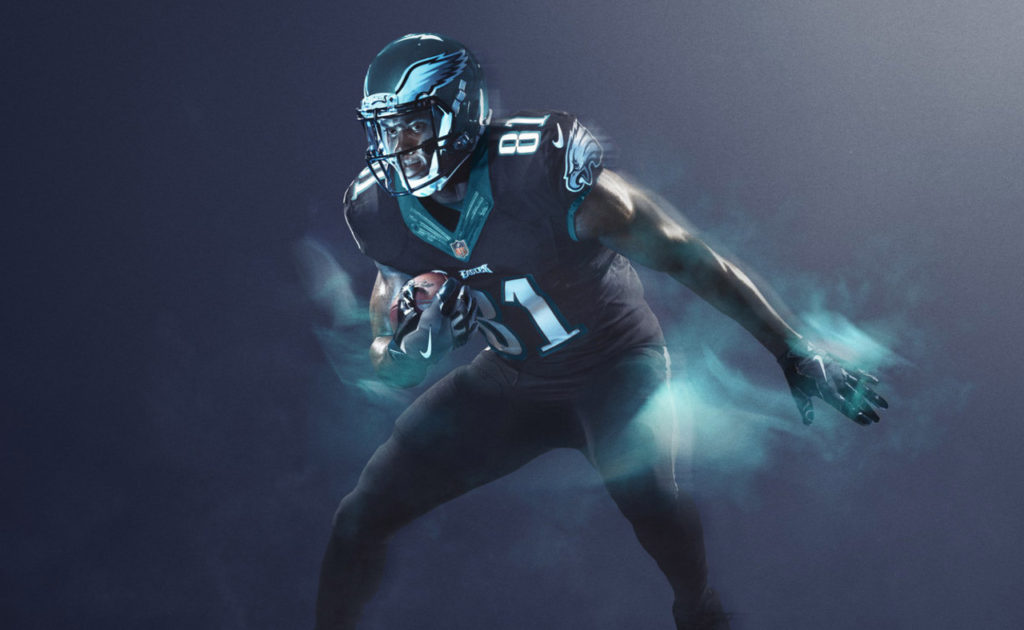
19. Philadelphia Eagles
Not a lot of contrast, but headed in the right direction with the black uniforms. Especially since the helmet doesn’t completely clash.
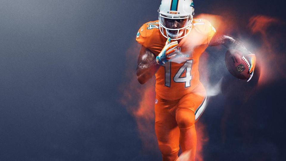
18. Miami Dolphins

I despise the Dolphins’ colors. I despise the orange color less. It’s a gutsy move and in the spirit of the whole “Color Rush” program. Thank you for not going blue.
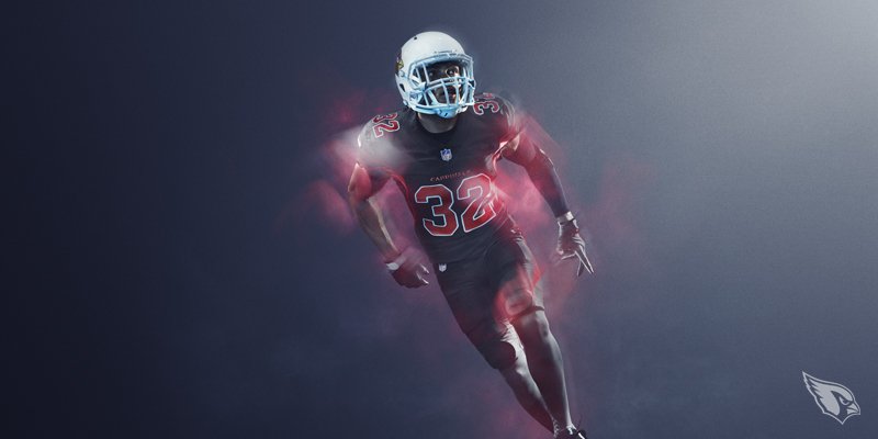
17. Arizona Cardinals

The Cardinals would be one of my top uniforms, if not for the all white helmet. Completely ruins the look.
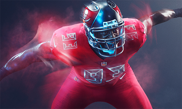
16. Tampa Bay Buccaneers

I don’t know how I feel about these. I don’t love them and I don’t hate them. They land in the middle. At least they didn’t go with the “creamsicle” orange color.
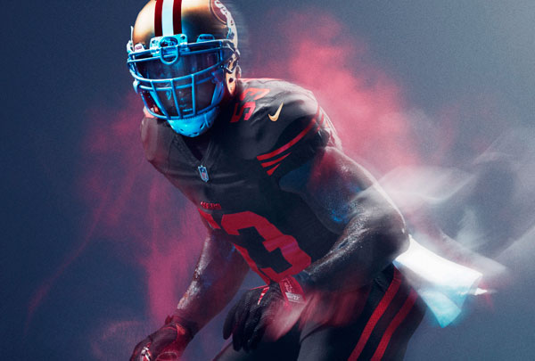
15. San Francisco 49ers

See Cardinals above.
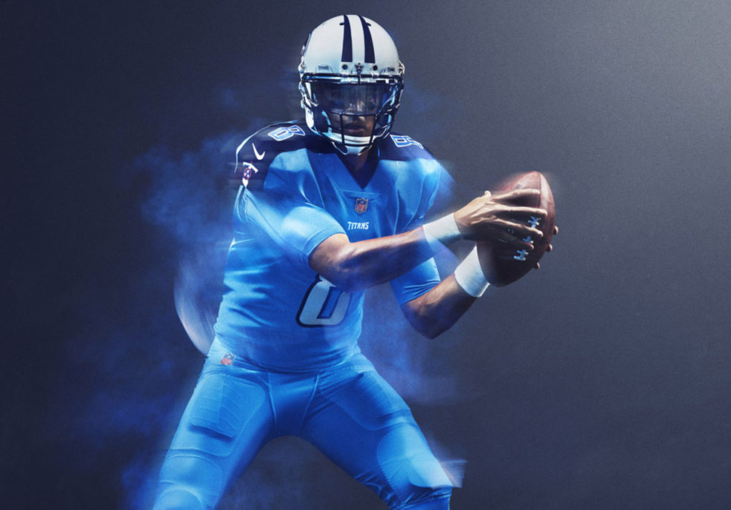
14. Tennessee Titans
These get praise for being so much better than their horrible standard jerseys.
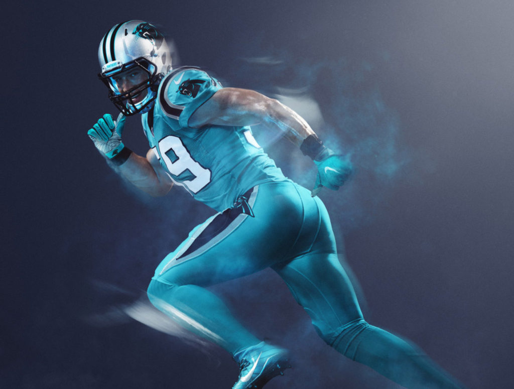
13. Carolina Panthers
While I don’t love the shade of blue, I can’t imagine doing much better with what they had to work with. I’m oddly glad they didn’t go with all black as I’m sure they were tempted.
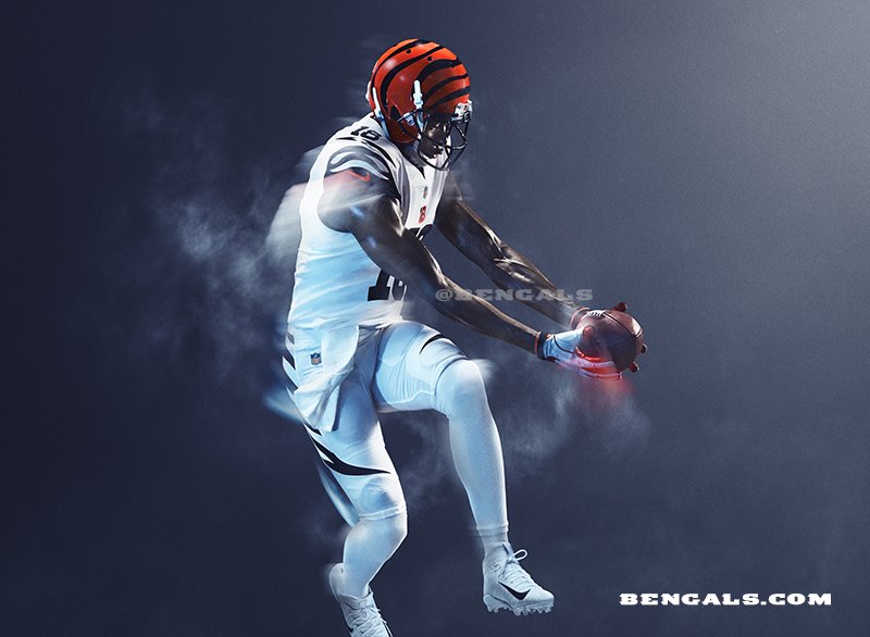
12. Cincinnati Bengals

I’m not sure why the Bengals went with all white, but it’s refreshing to see a change from their harsh standard jerseys.
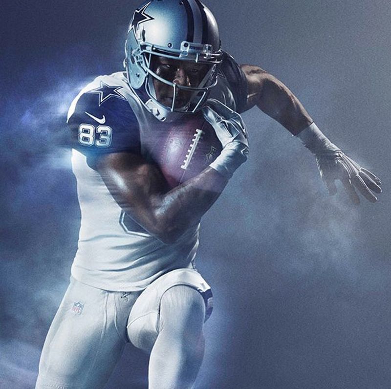
11. Dallas Cowboys

If only the Cowboys had gone all navy, how spectacular that would have been. But alas, there’s a bit of a 90s throwback to the cursed star-shouldered uniforms.
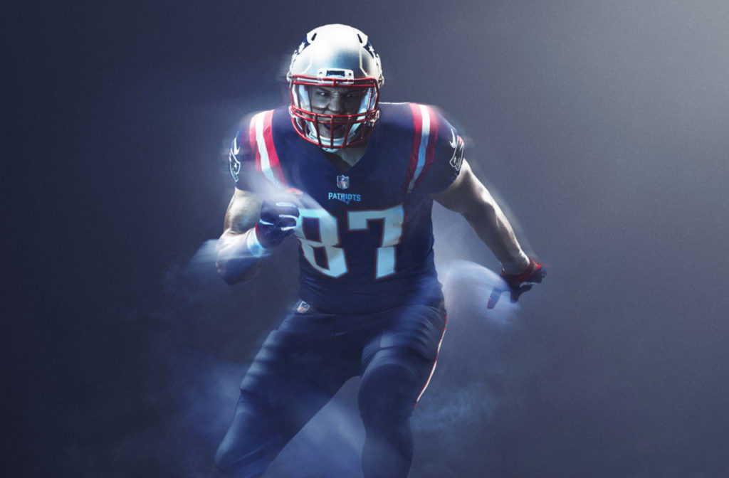
10. New England Patriots
Predictable. But clean and a touch retro.
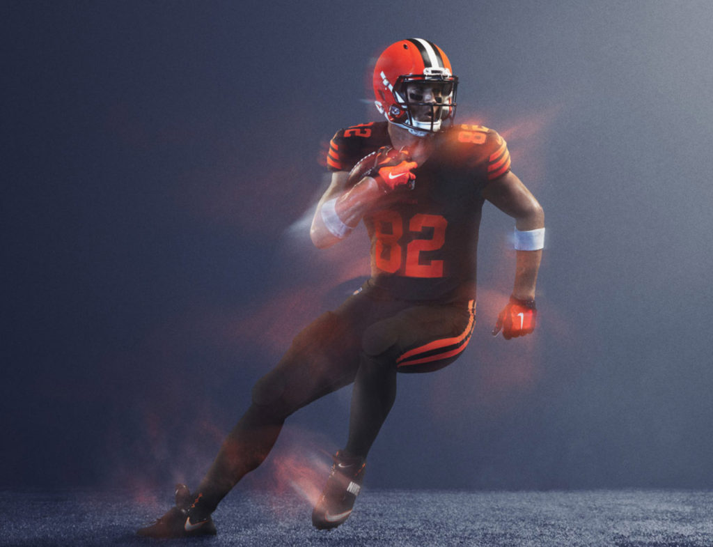
9. Cleveland Browns
These should be the Browns’ main uniforms, hands down. They’re brown.
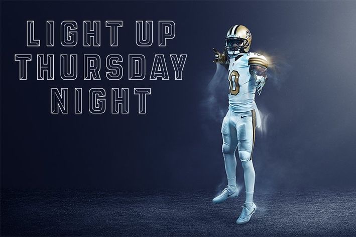
8. New Orleans Saints

The white/gold combo works oh so well.
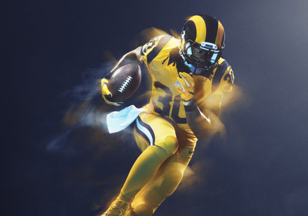
7. Los Angeles Rams
Unlike the ketchup & mustard Redskins, the retro color-blocked Rams uniforms are perfectly thrown back to their Los Angeles days.
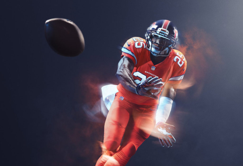
6. Denver Broncos

If you haven’t noticed, I have an affinity for the retro look, and although the solid orange is a big pill to swallow, the throwback helmets make it all worth it.
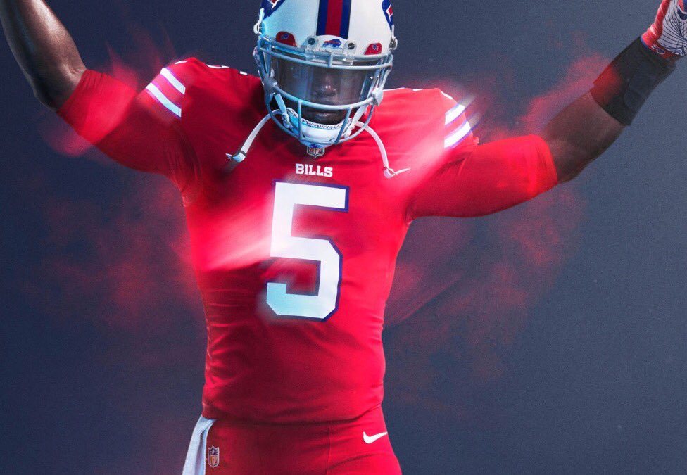
5. Buffalo Bills

I have to say I love the Bills’ predominantly red uniforms. My one complaint is that they should have busted out the throwback white/red helmets to pull the whole look together.
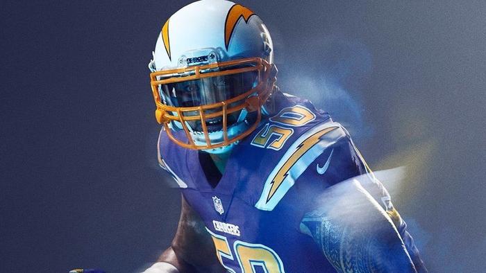
4. San Diego Chargers

One of the only true throwback uniforms, the Chargers get a retro look of royal blue, a call back to the 70s era of Fouts and Alworth.
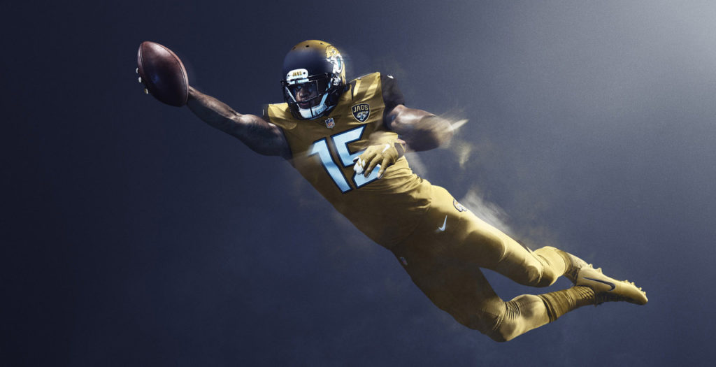
3. Jacksonville Jaguars
A lot of people don’t like these. I’m on the other side and think that they represent the “color rush” concept to near perfection. Except those helmets, the gradient needs to go across the whole helmet like the original concepts.
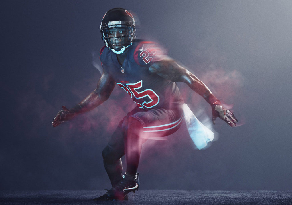
2. Houston Texans

Avoided red (good move), and I absolutely love the desaturated navy color. Some of the cleanest uniforms of the bunch.
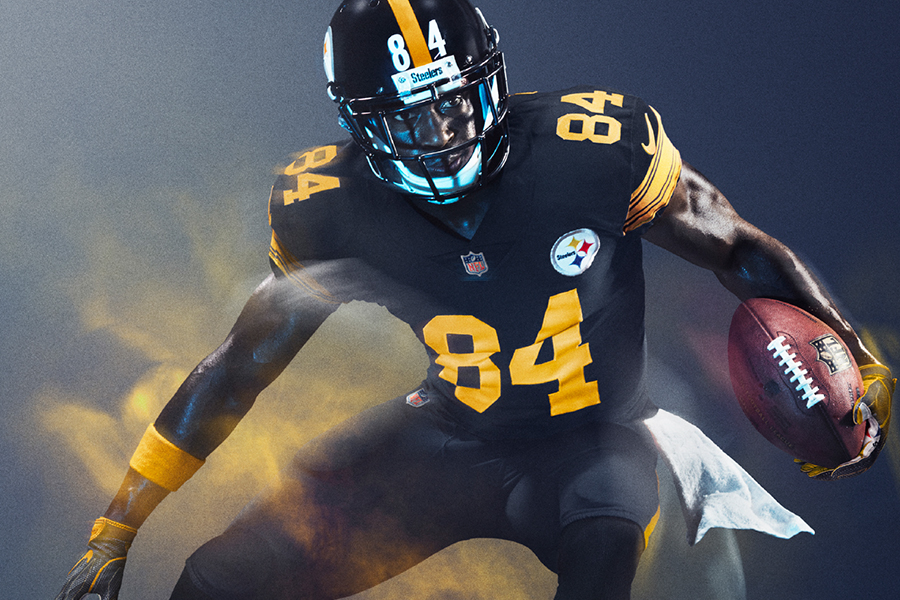
1. Pittsburgh Steelers

I’m not a Steelers fan. But these are the uniforms the Steelers were meant to wear. Intriguing how the black and yellow can contribute to the most horrid throwback uniforms in the history of football and also be the most clean and gorgeous color rush uniforms.
Tell me how wrong I am in the comments below.
